How To Create Our Top 5 Favorite Animations
Here at Stinson, we love to push the creative boundaries of PowerPoint's native animation tools.
A lot of design agencies will embed complex animations for PowerPoint as video clips, but we know how important it is for our clients to be able to edit their content for future presentations. That's why we do our best to create all of our content within PowerPoint, including the animations.
Creating professional level animations in PowerPoint often means setting multiple animations to play simultaneously. It's a bit of work, but we think the results are well worth it!
If you're an intermediate to advanced PowerPoint user, read on to learn how we make a few of our favorite content animations. (And don't worry, if this seems way too complicated, we can always help you out.)

For this animation, we'll use the 'Path Animation' tool to move objects around a central location. We create a rotation effect by applying symmetric animations to each of the objects in the circle.
How to create a rotation animation
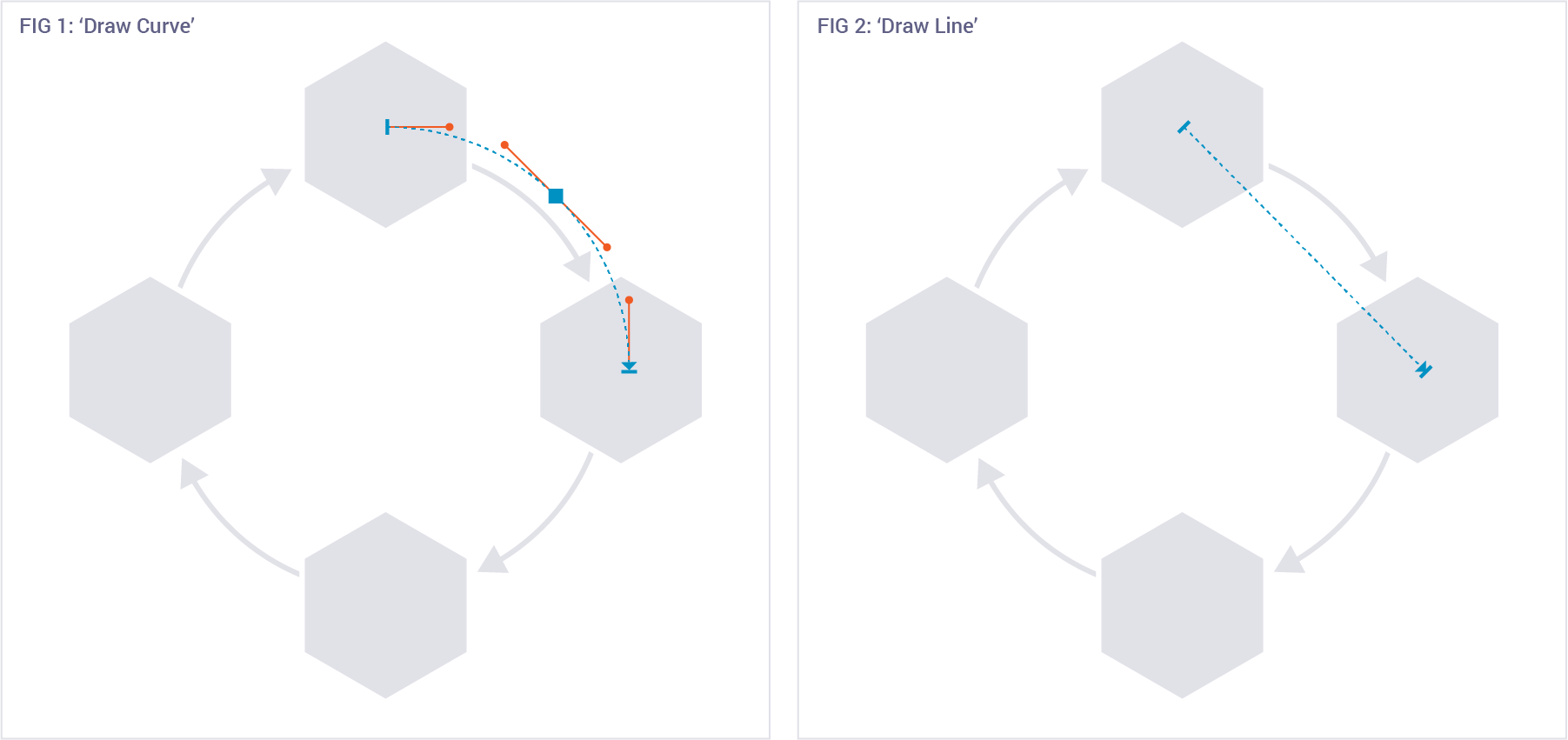
- The first step is to place your objects in their initial location. This is the starting point of the animation.
- Next, we will use the 'Path Animation' tool to move each object one quarter of the way around the circle. Depending on your comfort level with PowerPoint's path animations, you can use either the 'Draw Curve' tool (fig 1), or the 'Draw Line tool (fig 2). Both will create approximately the same final animation, but if you take the time to draw a curve, the final animation will be more refined.
- After you've added the first animation to each shape, make sure that you set the animations to play 'with previous' so that they happen at the same time.
- Repeat these steps for every additional quarter-rotation.

An illustration-focused animation is actually less about a fancy animation, and more about technical planning to decide how to create the graphics in a way that will let you create interesting movement. With a general idea in mind, we do most of our work in Adobe Illustrator before exporting the component parts to PNGs which we can then animate in PowerPoint.
How to create an illustration-based animation
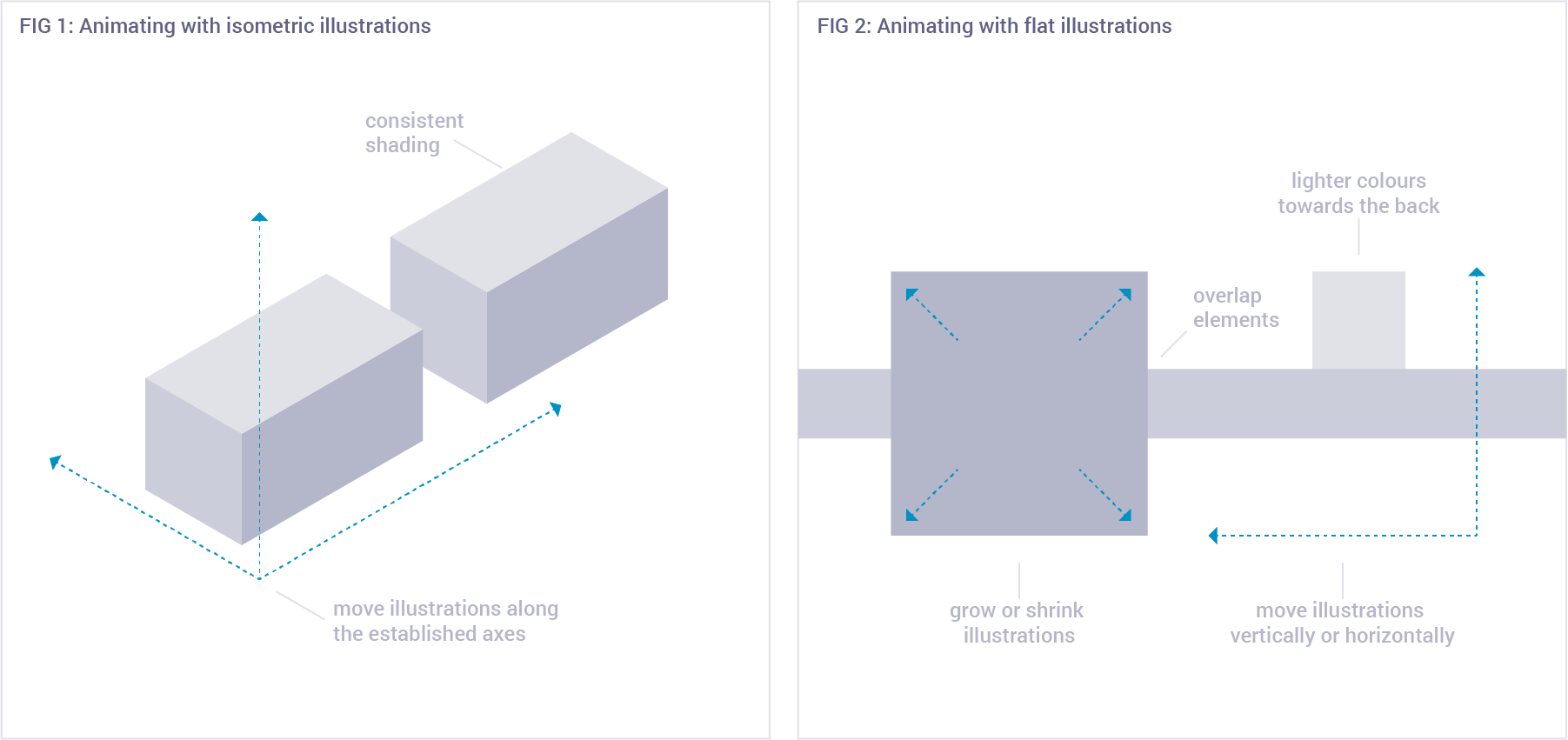
- Choose an illustration style that lends itself well to animation. We recommend using an isometric style or a completely flat style.
- Remember to keep your illustrations consistent (that means using the same shading style, matching color schemes, etc)
Animations to use with isometric graphics:
- When using an isometric style, choose animations that give the impression of moving through a 'real' space.
- After you've set up your illustrations in the slide, use the 'Path Animation' 'Draw Line' tool for your animations.
- In order to make this motion feel accurate, remember to move your graphics only along the axes that you've used in your illustrations (see fig 1).
Animations to use with flat graphics:
- When using a a flat style, create the sense of space by overlapping elements and making elements in the foreground darker and larger than elements in the background (see fig 2).
- Use the 'Path Animation' 'Line' tool to move graphics horizontally or vertically in the space.
- Use the 'Grow/Shrink' animation to make elements appear closer or further away.

Push animations are simple and very effective, especially when combined with push style transitions. Push animations allow you to continue the movement from the transition, making your slide change appear seamless.
How to create a push animation
- The first step is positioning your elements on the slide. You should place them where you want them to be after the animate-in has finished.
- Use the 'Fly In' animation and choose the appropriate direction from the 'Effect Options' dropdown.
- When using the push animation after a push transition, your elements should fly in from the same direction.
- TIP: Turn on the 'Smooth End' option to get a more refined animation.

Like the illustration-focused animation, a parallax animation also requires some graphic skills. Using Adobe Photoshop, we'll separate the foreground of a photo from its background.
How to create a parallax animation
- Choose a photograph with clear foreground and background elements.
- Open the photo in Photoshop (or whichever editing program you have)
- Duplicate the image in a new layer.
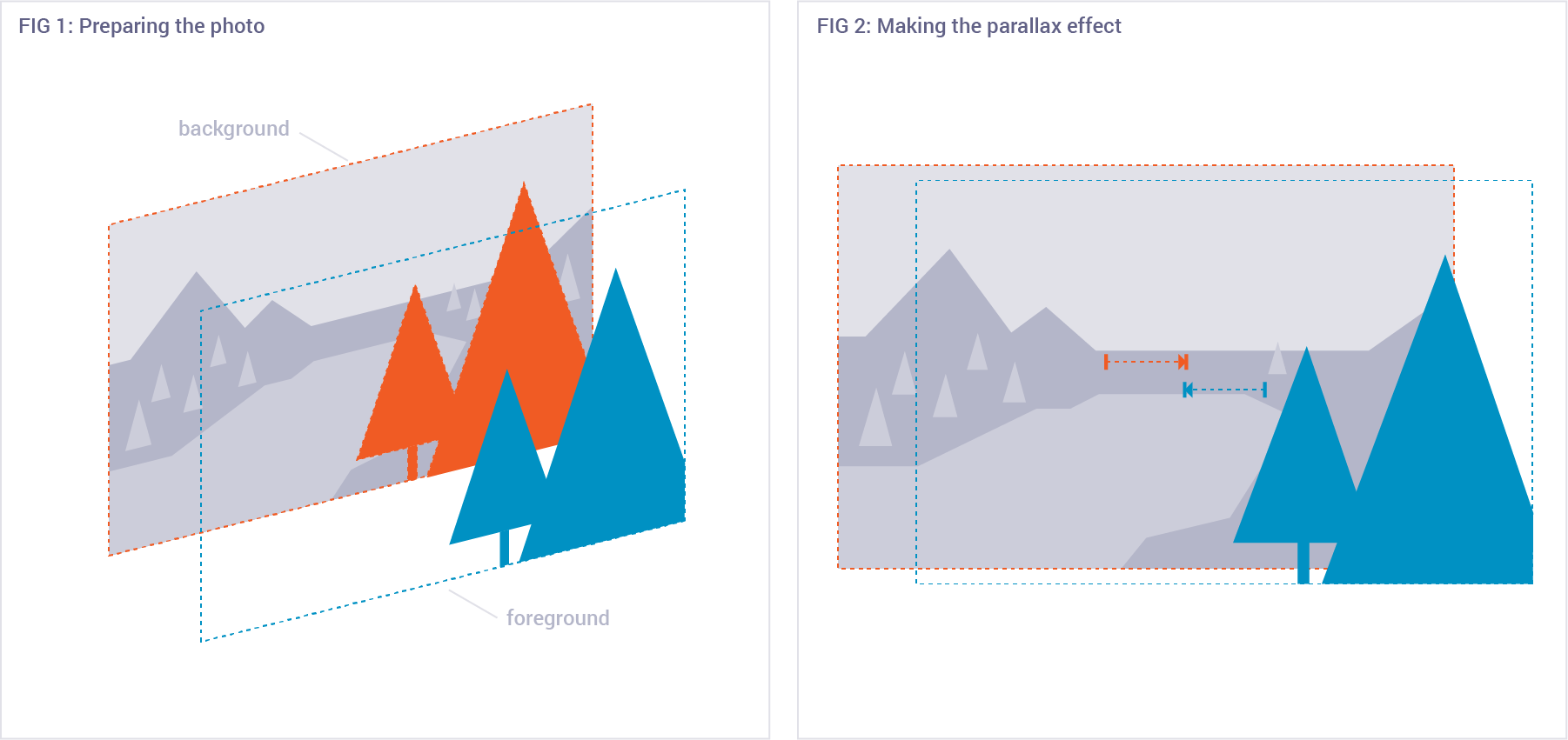
- Erase the background from the top layer (fig 1). Accuracy in isolating the foreground elements will improve the appearance of the final animation.
- In order to make a convincing animation later, we'll need to fill in the area behind the foreground (fig 1, orange section). We don't want to see a duplicate of the foreground element in the animation. If you're using Photoshop, you can take advantage of the 'Content-Aware' feature. This tool detects surrounding patterns and uses them to fill in the area you've deleted. To use the feature, use the Lasso to select the area containing the foreground element. When you press the Delete key, choose 'Content-Aware' in the Fill window that comes up.
- Save each layer into a separate PNG file. (Remember to save the foreground with a transparent background.)
- In PowerPoint, add both images to a slide and offset them.
- Use the 'Path Animation' 'Line' tool to move the images horizontally towards the center of the slide.

We love this animation because it looks super cool and doesn't require any photo editing. We'll complete this effect by animating shapes in PowerPoint.
How to create a geometric reveal animation
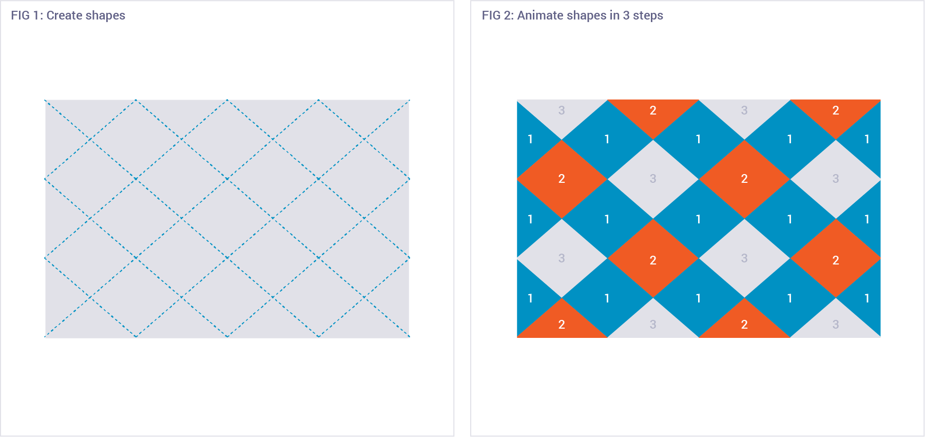
- Choose a geometric shape that will create a seamless pattern. We like to use triangles, diamonds, squares and hexagons.
- When you're happy with your shape, make enough copies of it to cover the slide and then line them up. You can make sure rows and columns are aligned by using the 'Align' tools, which you can find in the 'Arrange' dropdown in the 'Home' ribbon. (fig 1)
- Now it's time to style your shapes: select them all then choose the fill color, and a stroke if you want one.
- The key step in making the geometric reveal is to stagger the animations. Three steps is usually a good starting point. You may find the easiest way to do this is by selecting about one third of the shapes at a time. This way you can control which shapes animate together.
- Add a 'Fade' animation to each set of shapes.
- TIP: Try not to put neighboring shapes in the same animating step (fig 2) unless you intend to reveal a specific part of the image first.
- Finally, add your photo to the slide and use the 'Arrange' tools to 'Send to Back'.


